![]()
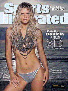
DEPTH CHARGE: the Year 2000 3-d Swimsuit Issue of Sports Illustrated
|
|
|
|
|
INTRODUCTION In March of 2000, Sports Illustrated published a Swimsuit pictorial (Depth Charge) using the anaglyph 3-d process. The general production quality was very high, with good anaglyph color design and separations, and excellent quality 3-d glasses included with each magazine. It is the highest quality 3-d that I have seen published to such a large audience. I'm sure that I speak for everyone when I say "thank you" to Dave Klutho and Ron Labbe of Studio-3d for pulling this off with SI. This review is more of an analysis of the art and science of anaglyphs than just a critical review of 3-d swimwear imagemaking. The Depth Charge section really is a great resource for the student of anaglyphs, as it provides pictures that are presented with a range of geometric qualities - serving well the purpose of identifying what makes some anaglyphs work well, and others poorly. As important as the analysis is, I was not able entirely to abstain from some artistic criticism. I do realize that it is infinitely easier to recommend improvements after the fact, than to effectuate improved results during the production of such a large project. ESPECIALLY when one is not the leader of such a project. Possibly even more than their skills, which I know to be considerable, I am impressed with the patience, perseverance, and humility that Klutho and Labbe must have drawn upon, in order to finish with this project (and retain their good humor).
THE GLASSES I'll start my "page by page" review with something easy. The first page of the 3-d section includes the anaglyph glasses. I am so glad that Klutho was able to prevail in his efforts to get the glasses from Theatric Support, despite the (likely) extra cost. That's because these are probably the best glasses one can get. The way I judge glasses is to look at the lenses for distortions - irregularity in the thickness of the lens, and to examine the filter color for extinction properties. The lenses in Theatric Support glasses came to my attention last summer (Steve Aubrey sent me some of the IMAX version). When you fold the lenses over to cover each other, you will notice that they pass almost no light, despite the fact that individually these lenses are of low density (i.e. they are bright). Another thing I noticed is that the light from red LEDs (a very bright red source) is TOTALLY extinguished through the cyan lens, which is something I had not seen before in anaglyph glasses. So my intuition, and my impression in using the glasses, was that these were very good. And I told Klutho as much last summer, as he was preparing his proposal to SI. Good for us, that he was able to get them inserted.
DISCUSSION In glamour photography, voyerism is an essential component within the audience. The voyeur seeks realism, clarity, and proximity. To satisfy these needs, it helps to have the printed field of view similar to the camera field of view (realism). It helps to have reasonably good depth on the subject (clarity / proximity), and it helps to be close to the subject (proximity). This is what the reader of the Swimsuit issue wants. Did he get it? CAN HE GET IT?! ...given the limitations of anaglyphs and page size! A tautomorphic anaglyph image recreates the subject in space at the same size and with the same depth, as if that object were really there. When you are given the page of a magazine as your canvas, this can be done only with small objects, or portions of larger objects. For example, in the case of a person, one could recreate a tautomorphic portrait of the face on a magazine page. But the size of faces being what they are, that's all that would fit on the page. (Or, if you prefer, one could fit one cup of a bikini top). To do a full figure in a tautomorphic fashion would require a very large print indeed (I know because I have done it). So, to the extent that full figures, or nearly full figures are presented in this magazine, something has to be compromised. That thing is depth _or_ realism (read on to see why I think depth conflicts with realism). All of the pictures in the 3-d section (that show full figures) have to be a compromise. What's really interesting is that the compromise can be done in different ways. There is a range of depth resolution that can be achieved with the full figure on the page. At one end of this range is the orthostereoscopic representation, where the figure appears correctly scaled in the x, y, z space of the page, only reduced in size. To achieve this, one has to shoot up close _and_ with an expanded stereobase. This sort of presentation would have "maximum" depth. One cannot say that this is the most realistic way to represent a figure on the page, however, because it produces an image that is lilliputian. What I mean is, it makes the figure look like a little doll on the page. This may not be satisfying to the voyeur, insofar as he seeks proximity and realism. In the middle of the range is a relatively flattened representation, where the z axis scale is compressed somewhat. I will argue that somewhere in this range is an ideal, difficult to define for all situations, where realism is balanced with depth effect - where the subject no longer looks so lilliputian, but still retains good depth "clarity." At the "far" end of the range is the "flat" figure, where very little or no depth is seen in the subject. The subject may look realistic, just as it would look through binoculars or a telescope, but the sense of proximity will be lost. Because of the problem of ghosting in anaglyphs, and because of the undesireable mismatch between accomodation and convergence when viewing small anaglyph prints, deviation has to be kept limited. This naturally limits the total depth that one can put in the pictures. Some guides regarding the preparation of anaglyphs recommend that total deviation not exceed 13mm (one half inch). With our standard viewing geometry (interpupillary of 63mm, viewing distance of 45cm), that limits total depth to a little less than 12cm of depth. Someone at SI must have been reading this guide; throughout the SI 3-d section, most of the pictures have a total depth less than 10cm (4 inches) - with one notable exception having some 27cm (over 10 in.) of total depth! I could probably argue all year with a number of people involved in this fine metier of making anaglyphs, that the 13mm deviation limit is unnecessarily restrictive, that one can design images with far greater deviation that are easily viewable. But even given the 13mm limit, one can still produce images of stunning depth. This is something remarkable about anaglyphs: that one can pack the illusion of far greater depth into such a shallow apparent space. But because the apparent depth of anaglyphs is so limited, it is far more important that careful attention is paid to the stereography of the _main subject_, to assure that within the entire apparent depth range a sufficient fraction of that depth is devoted to the subject. As you review the pictures in the magazine, note the relationship between total real depth in the scene, total apparent depth, and depth on subject. Some interesting relationships can be found. Generally, shots with greater total real depth can devote less of their allocation of apparent depth to the main subject. Does that mean one should not shoot scenes with lots of real depth when doing 3-d glamour? The two pictures with the least apparent depth were shot with strong telephoto lenses. If you want lots of apparent depth, does that mean you should stay away from telephoto lenses? If tele lenses are necessary, to counteract larger distances to subject, should one shoot with expanded stereobase? Most of the camera equipment on the shoot was fixed "normal" stereobase RBT cameras. I wonder if the twin rig Hassy saw any use at expanded stereobases?
CONCLUSION The Room and Board pictorial, which immediately precedes the Depth Charge 3-d section, contains 11 portraits of models. Every single one of the portraits is a close up, with most showing the figure just from the thigh to the head. In the first pictorial, The Snake in the Garden, nine of the portraits (out of ten pages) are close up on the models. Any of these close-up portraits, as long as they had been taken physically close to the model or with expanded stereo base, would have made a more satisfying stereo portraits than many of the pictures in the Depth Charge 3-d section. It is not for a lack of opportunity, or a lack of stereophotographic talent, or even for some stylistic requirement of the magazine, that the 3-d section fails to deliver the effective dimensional close up portraits that the readers crave and should expect. In short, many of the pictures do not show the levels of depth and three dimensional structure of which the medium is capable. I do not believe this came about because of a lack of talent behind the camera. The primary stereographer, Dave Klutho, who is on staff at SI, is an experienced award winning stereo photographer; and the technical consultant, Ron Labbe of Studio-3d, brought more than twenty years' stereographic experience to the project. I believe the primary culprit is in decisionmaking and art direction that is uninformed of the advantages that 3-d can offer the reader, and of basic stereoscopic theory: of what looks good in 3-d, of what is suited to 3-d, and how to shoot it. Ron Labbe, in defense of the jumping horse shot (p.112, Estella on horse), said he had no input on the editing. He said that each situation was likely photographed from a variety of positions, using many different lenses, distances from the subjects, etc. So the horse jumped when the photographers were shooting distant shots, and it's the jump that got it in, despite poor depth quality. But I have to ask: why were they shooting distant shots in the first place?! If working with fixed normal stereobase cameras - as I believe was the case - every single shot should have been taken close up with a normal or _mild_ telephoto lens, period. If a twin rig was available (and I think a twin Hassy, probably Klutho's, was there), then an expanded stereobase should have been used on shots that needed to be distant for some reason. Okay, maybe I should relax. The dog can talk, and that's great. It's been a long time since 6.5 million guys, who wouldn't ordinarily pick up a National Geographic, have heard a dog talk. Certainly they've never heard one talk so well - possibly at a grade school level. But what they will never learn from this swimsuit issue, is that the dog can SING! We know the dog can sing! We've known for 50 years, 100 years! He can sing arias and ballads, punk rock and folk songs. He has a beautiful voice, incredible tonal range, awesome timbre, and great DEPTH of feeling. One of these days, we shouldn't settle for less than to have the public hear the dog sing! Thanks for putting up with my stereo fanaticism. Boris March 15, 2000
P.S. (what this about the dog?!)
I was working mid December on finishing the cover artwork for OVERDRIVE magazine when the art director finally had to pull the plug on my efforts. The cover art was already approved, everyone at the mag was happy, very happy with it. But I had found one more thing that really needed to be fixed. (Now, I will leave the finding of this thing an exercise for the reader). I am a pretty picky critic, and no more so than of my own images. The deadline had passed, but I kept calling and emailing the magazine, begging for them to let me send a file with the improvement. The press date was still two weeks away, so I thought surely they can take another file. Finally the art director called, and sensing that I was very agitated, told me this little story. Some years back, he had discovered a dog that could talk! It was able to form basic sentences and make its wishes known. The grammar was not very good, and every now and then the pronunciation of a word was off. He took the dog around and showed it to many people. Without fail, everyone was totally amazed. People had never, or only rarely, seen or heard a talking dog. But more importantly, he pointed out to me, no one ever said anything about how occasionally the grammar was off, or a word was mispronounced. It just didn't seem to bother anyone This set me at ease. Good night. Boris |
DEFINITIONS Terminology is important in this review. My definitions may or may not be strictly "correct," but I need a linguistic foundation here. Printed field of view - The angle subtended by a picture on the page. The apparent angular size of the picture. This is a function of the size of the printed image and the distance from the observer's eye(s) to the page. Unless otherwise noted, let that distance be 18in. (45cm). Camera field of view - This is the angle subtended by the printed image, as it appeared to the photographer when he took the picture. This is a function of several variables, some of which cannot be known: the focal length of the lens(es) on the camera, the size of the film, and the amount of cropping (i.e. what fraction of the film's image is actually reproduced in the print). Stereobase - This is the distance between the two optical axes of the stereo lenses. Interpupillary separation - This is the distance between your two eyes. Homologous points - A single point in a given view will be reproduced twice in a stereo image. The relative horizontal separation between homologous points gives the impression of depth. See Deviation. Deviation - The measurable separation of homologous points in the left and right images on the page. This is the paper equivalent of "on-film-deviation" that is used in relation to stereo slides. Deviation is what creates the impression of depth. Points with lots of deviation appear far below (or above) the surface of the page. Apparent Depth - This is the actual measurable depth in the image on the printed page. This is a function of deviation, your interpupillary separation, and your viewing distance from the page. Click here for how I measured apparent depth in anaglyph prints. I will list values for apparent depth in the SI prints below, which have been measured assuming a viewing distance of 45cm (about 18 inches), and an interpupillary distance of 63mm (about 2.5 inches). Real Depth - The actual depth in the scene as seen by the photographer at the time of shooting. When looking at an anaglyph image of the scene, we can estimate this. Parallax - rate of change of deviation vs. real depth. Tautomorphic - I will define very broadly: a viewing experience where the depth and scale of the object appears absolutely realistic. An object whose actual size permits it to fit on the page without reduction, would exhibit the same scale and size in all three axes: the apparent depth would match the real depth. Orthostereoscopic (Ortho) - a subset of tautomorphic, except involving a reduced size reproduction of the object in the image. A larger object reduced to fit on the page would appear correctly scaled in all three axes. See lilliputism. Lilliputism - The effect in stereoscopic display, where the reduced size orthoscopic presentation of a subject - let's say a model wearing a bikini - makes the subject appear to be a tiny, doll-like object on the page. Accomodation - The work done by the lens musculature of the eye to optically focus on items at different real depths in real space Generally, when looking at stereoscopic imagery (such as an anaglyph print), the eyes accomodate for the distance of the print only - accomodation does not change when items are viewed at different apparent depth levels within the stereoscopic image. Convergence -The work done by the eye pointing musculature to toe in the eyes on items at different depth levels in real space and in the virtual space of the stereograph. Deviation within the image necessitates convergence. Extinction - The quality that 3-d glasses have which minimizes ghosting or crosstalk - where the left and right images are well isolated from each
ANALYSIS p.90-91, Daniela playing with sand. Real Depth of entire picture: 200m+ Apparent Depth of entire picture: -5cm to +22cm Apparent Depth of subject: -5cm to +7.4cm Artistic comment: The 3-d composition of this shot is very strong. Lots of good depth on the main subject. Daniela is posed lying with her body horizontally stretched away from the camera. Her hand is reaching out towards us, apparently 1.5 inches out in front of the plane of the paper. She is letting sand fall through her fingers, and one can see her other hand behind and through the falling sand. The 3-d really helps us to see the texture of the beach on which she is lying. There is good 3-d detail visible in her hair and face, including a sparkle in her eyes! The field of view seems pretty normal, bordering on wide angle, but because the image is a two page spread, the parallax is good. This is a good picture from the standpoint of depth composition and near-orthoscopic presentation. Technical comment: This image gives such good results because it is very close up and has a close to normal field of view. Interesting is how with such a close-up, deviation for the far points (beach at top right of page) has been held within tolerable limits. It appears there is a break in the parallax - the progression of depth is not continuous. This may have been achieved through post processing of the image. My measurements indicate that if the parallax of the foreground were maintained to the background, deviation at the top of the page would have been over 1.125 inches (30cm), which would have been a bit much for an anaglyph of this size (it would have given 40cm of depth). Instead the parallax is reduced starting about halfway up the page, about where the sand takes on a more muted appearance. From there on up, the background appears spatially compressed (it appears tilted up) in comparison to the foreground, and careful measurement of deviations in the picture bear this out. Then again, it could just be that she was photographed on a substantial uphill (i.e. with the camera tilted down), with the distant background flat.
p.92, Audrey standing among leaves. Real Depth of entire picture: 3m Apparent Depth of entire picture: -2cm to +5.5cm Apparent Depth of subject: 0cm to +1.4cm Artistic comment: Although the 3-d on the primary subject is mild, the overall composition is great. Audrey is standing among a complex of leaves, where the 3-d really helps clear the clutter. So her surroundings look great in 3-d. Technical comment: Again likely shot fairly close up (we see her waist up), with the field of view close to normal. This shot would have been even better reproduced full page. At its present size of little over half page, some depth information on the girl is too subtle. Silly comment: As there is no bathing suit in the pic, we should be thankful that all the other pictures "subsidized" the printing of this one!
p.93, Heidi throwing hat. Real Depth of entire picture: 10m Apparent Depth of entire picture: -5cm to +3.8cm Apparent Depth of subject: -1.0cm to +1.4cm Artistic comment: This shot has one very strong 3-d feature: the hat floating 1.5 to 2 inches in front of the page. There is other depth in the picture, although it is not so strong. My main gripe is that this shot is a classic example of using 3-d as a gimmick. But as someone pointed out recently, the whole swimsuit issue is a gimmick (even without 3-d), so maybe that's nothing to worry about. Technical comment: With 2.4cm of total depth on subject (albeit because of outstretched arms), one could say that the subject is sufficiently 3-d.
p.94-95, Daniela lying on bed of leaves. Real Depth of entire picture: 1m Apparent Depth of entire picture: -4cm to +4.7cm Apparent Depth of subject: -3.0cm to +3.3cm Artistic comment: I do like this shot. Matching the relatively wide camera field of view with a two page spread is good. Depth revealed is only modest because of the pose, which is across the page, not into the page. The pose is weak also for aesthetic reasons: the way she is lying is very unflattering to her hips, butt, and thighs. I think this shot would have been presented better blown up on the spread, showing her from the tip of the head to just above the belly. This would have increased deviations and depth and brought the picture another step closer to orthoscopy. It would have made 3-d details on her face and bikini top clearer. (For example, see Trojan ad on page 85. Why the fear of close-ups? We want to see those bumps!) Still, its one of the best in the mag. Technical comment: This is one of three pictures in the section that show what I would call "near" orthoscopy. It is a pleasant balance of sufficient depth on the main subject, without making her look lilliputian. Also, the total real depth shown is not so great, so her figure can take up most of that depth.
p.96, Audrey with ropes. Real Depth of entire picture: 5m Apparent Depth of entire picture: -1.4cm to +7.5cm Apparent Depth of subject: -0.5cm to +1.4cm Artistic comment: There is a spatial discontinuity behind Audrey (i.e. empty space with a relatively distant background) which is not bridged - nothing helps the eye travel into the space. Technical comment: Shot with telephoto and insufficient stereobase / from too far away, this picture shows a relatively narrow camera field of view with little parallax on the subject. She gets only a small fraction of the total depth available.
p.98, Heidi jumping and kicking up sand. Real Depth of entire picture: 50m Apparent Depth of entire picture: -1.0cm to +7.5cm Apparent Depth of subject: -0.7cm to +0.7cm All the comments for p.96 apply, except that the flying sand is interesting.
p.99 Lujan on the beach. Real Depth of entire picture: 10m Apparent Depth of entire picture: 0cm to +6.5cm Apparent Depth of subject: 0cm to +1.4cm Artistic comment: This wide angle, wide field of view close up shot would have been great as a full page, or even a spread. At the current size it is good but represents a lost opportunity. Also missing is that splash of water, had Lujan been posed in a little deeper. Technical comment: With the surface of water "carrying" the eye into the page, much more deviation could have been used, much more depth shown. As it is, the picture could also have been truly orthoscopic, given much more stereobase.
p.102 Kylie standing in water. Real Depth of entire picture: 4m Apparent Depth of entire picture: -2.7cm to +8.4cm Apparent Depth of subject: -2.7cm to +2.2cm Artistic comment: This picture is very interesting, because at first glance it is so similar to the previous picture (p.99), but shows a much more pleasant depth. The greater depth comes from the more narrow camera field of view (telephoto shot) and the look down angle, which enhances parallax on the model. This is another picture with a wonderful balance between slightly compressed space (to avoid the sense of lilliputism), yet with a good amount of the existing depth devoted to the subject. Your eye is led down her body into the page, where it meets the water, which takes you in deeper going back up the page. I find it works best with the page held about two to three feet away, which probably helps match the printed field of view to the camera field of view.
p.106, Daniela in the Hacienda Real Depth of entire picture: 5m Apparent Depth of entire picture: -1.0cm to +3.0cm Apparent Depth of subject: not measurable Artistic comment: This is a well done flat glamour shot.
p.109, Heidi running, splashing water. Real Depth of entire picture: infinite Apparent Depth of entire picture: -2.0cm to +8.5cm Apparent Depth of subject: 0.0cm to +0.7cm Artistic comment: Model looks nearly flat. Despite insufficient depth on the model, one thing elevates this shot to being one of my favorites in the section: the 3-d resolution on the splashing water. That looks so good in stereo, it is easy to overlook the distortions/space compression caused by telephoto lens, narrow camera field of view. This is a classic Klutho shot, where he has captured something that can best be shown in 3-d. The complexity of the water spray, the spatial distribution of flying droplets, etc. A great shot. Technical comment: looks best from two feet away (or more), where your printed field of view comes closer to camera field of view.
p.110-111, Shakara reclining on bed. Real Depth of entire picture: 3m Apparent Depth of entire picture: -2.0cm to +9.5cm Apparent Depth of subject: -2.0cm to +6.5cm Artistic comment: Color and space composition are just great in this shot. Taken fairly close up, with the pose receding into the page among a clutter of pillows and other props. Very nice depth effect due to the fact the model takes up a large fraction of the available apparent depth in the picture. Also the total apparent depth is similar (scaled down) to real depth. This is the best picture in the section, from the standpoint of balancing a near ortho presentation with pleasant realism in a full figure shot. (Boy, but wouldn't it have been great to have a two page spread of this stereograph, cropped from her tummy to her head?)
p.112, Estella on horse. Real Depth of entire picture: infinite Apparent Depth of entire picture: -0.7cm to +3.8cm Apparent Depth of subject: not measurable Artistic comment: This shot would have made a great cover for the magazine. The reason? It does not look much like an anaglyph. Maximum deviation is not very high, plus is resident in very muted low contrast areas (the distant skyline). As a result, the colors are pretty normal overall. The strongest anaglyph color fringing is on the jumping horse, but because the horse is apparently in motion, this "hides" or camouflages the anaglyph quality of the horse edges - they can be interpreted as motion blur. Since the girl has no anaglyph fringes on her, she looks great as if on a flat cover shot. Finally, reproducing the picture as large as possible on the cover would have increased its paltry apparent total depth. Isn't hindsight great? Technical comment: Strange how a picture with maximum real depth (it shows infinity) has so little apparent depth. Inevitably the main subject (which I will assume to be the girl on the horse) is totally flat. I've seen an excellent close up action horse shot from Klutho (where horse and rider are practically jumping over the photog.) Non stereo knowledgeable friend who has the magazine (then gave it to me) pointed this picture out (from memory) as appearing unsatisfyingly flat. They added that they thought lots of the pictures looked strangely flat. |
|- H o m e -|- P o r t r a i t s -|- T E C H N O B O T -|- C O M W O R K -|
Unless otherwise noted, all contents of this page, individual or
aggregate, are copyright 2000 Boris Starosta.  All rights reserved.
Unauthorized duplication is a violation of applicable laws, and is
destructive of free enterprise, creative expression, and the human
spirit.

The Sports Illustrated cover image is copyright 1999, Time, Inc.
Fairly used without permission. All other product names mentioned
in these pages are used for identification purposes only, and may
be trademarks or registered trademarks of their respective companies,
and the exclusive property of their respective owners.